ICONS - UI creation example
icon creation process - to simplify, be consistent, and as clear as possible
I used the icons to tell a story, while at the same time hitting the target goal - icons that show you exactly what you want
Art Direction: Anwar | Artist: Travis


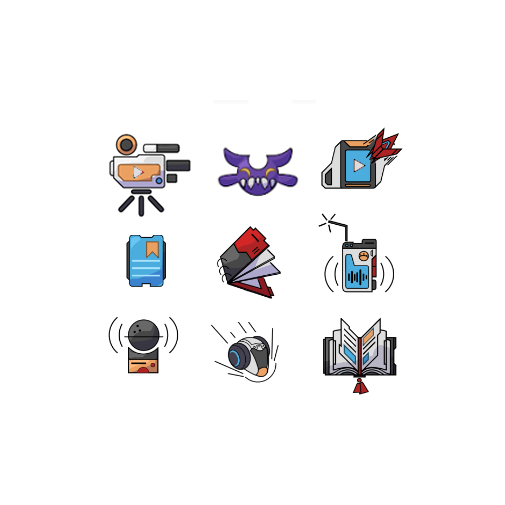
Final UI icons - close up details

Process Overview for Icon creation
This is a conversation between 2 artists. My personal art direction style is the same as sitting with the artist/team and letting our creativity flow - sharing inspiring positive momentum, while at the same time drawing with them and talking with them about the art as we progressing to final designs. Below are my points of direction for creating these wonderful little icons.
(above) Task: “let’s make a suite of icons to be used as game reward icons for an upcoming project - the PLASMAworlds Kickstarter launch. Here is the current list - with quick sketch examples I’ve quickly roughed out to get the ball rolling. Lets continue with this simplified style while maintaining that PLASMAworlds charm of future, hi-tech, minimal, cool style - meaning feel free to add your own future style to it. Enjoy yourself.”
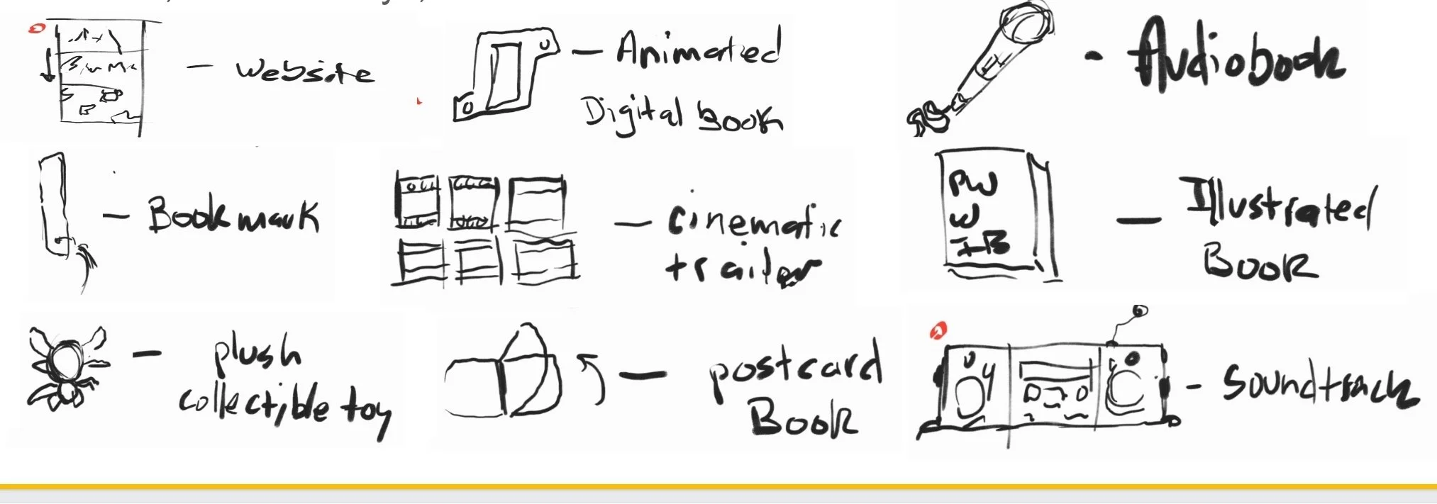
Icon thumbnail rough pass 1
(below) Icon thumbnail rough pass 1 - 3-5 super fast ideations/ designs/ compositions that let me know the present take.
I like the classic use of Flash adjacent style for the icon design language. The thick black lines, simplification and clarity.

1st round feedback
I am looking to instill character, world context, enhance the hi-tech style and make sure everything looks catchy and fun. Below, I share my direct feedback to the artist. This includes paint-overs directly on the art. We are actually having a blast.
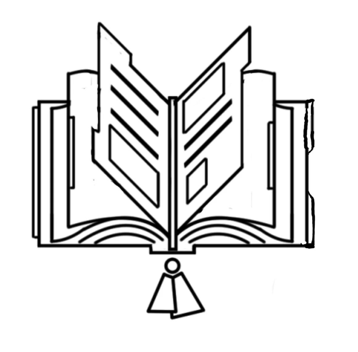
(below) “Attached in 1 image below is the book choice icon and bookmark. I like that the book looks alive and inviting/ open. It also looks a little futuristic in its shape language. The same going for the book mark, also it doesn't look like a traditional bookmark. It looks unique and that is exciting. It takes me back to the use of a flyer or a postcard as a bookmark days. Love it.”


(above) “attached microphone. the closest thing to popping out as having some personality was this one but it needs some high tech future elements to it. also it looks like its almost a robot... so lets run with it hey? minimal microphone robot.”
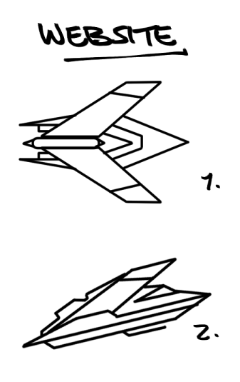
“to the website. below. love these icons. can we do a crash icon too. i feel like that talks to the website.”

(above) “to the postcard book. image below. here’s a direction i want to go in lets see you add some future on it. “
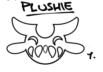
(above) “to the plush. This one is so full of characters and fun. lets progress”
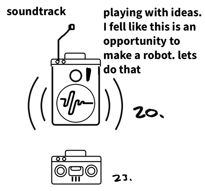
[below] “Attached soundtrack. I was playing with mixing and matching some of your ideas and then i realized this is definitely an opportunity to make a PLASMAworlds beat/ muslc robot... so lets do that.. lets make a beat robot and also lets assign robots to all the icons that allow for it. more notes below.”
“to the trailer...no image included all those icons are looking too classic and not future enough. feel free to default to a quick camera robot. no image for trailer based on the sketches thus far. needs a revisit.”

(Above) to the animated book, I like the bottom version, its our class PLASMAworlds style. the top one was just an idea. let me know if it's inspiring anything.. any sketches are anything
Second Pass: Revisions/Evolutions
You can see here the icons have taken a shift upward, towards the moon with varying embellishments leaning towards hi-tech.